Morrow
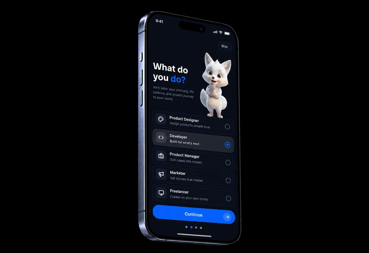

User Interview & Insights
Five themes the app is built around
- 33 percent: Realistic Planning
- 88 percent: Work-Life Boundaries
- 30 percent: Budget Clarity
- 96 percent: Steady Growth
- 25 percent: Flexible Recovery



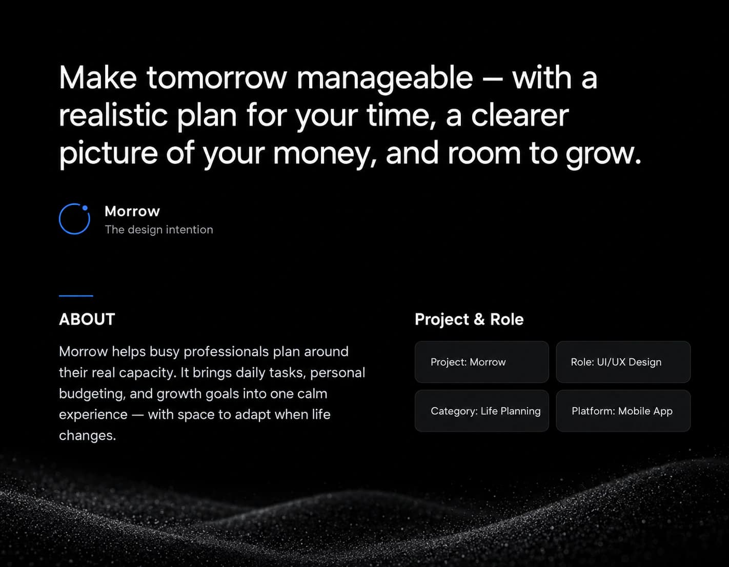
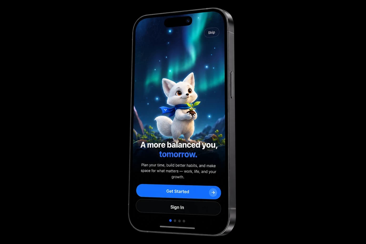
Make tomorrow manageable, with a realistic plan for your time, a clearer picture of your money, and room to grow.

MorrowThe design intention
ABOUT
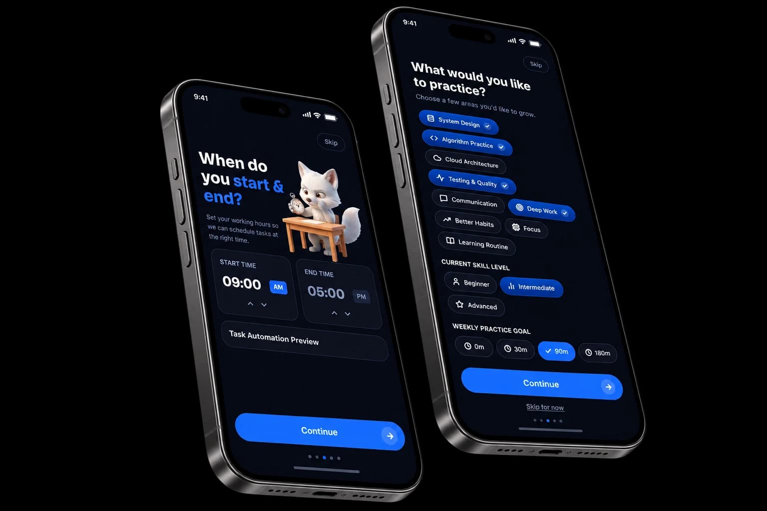
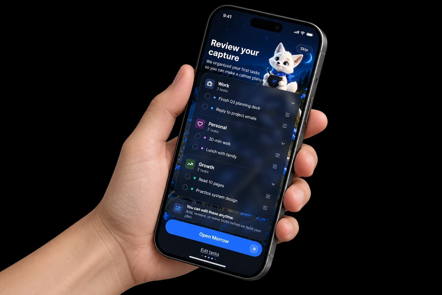
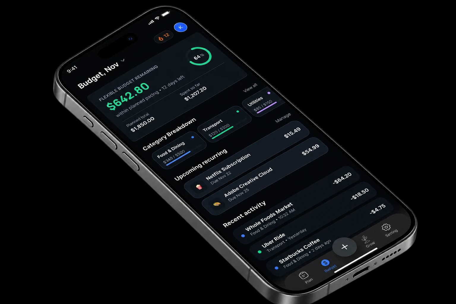
Morrow helps busy professionals plan around their real capacity. It brings daily tasks, personal budgeting, and growth goals into one calm experience, with space to adapt when life changes.
Project & Role
- Project
- Project: Morrow
- Role
- Role: UI/UX Design
- Category
- Category: Life Planning
- Platform
- Platform: Mobile App
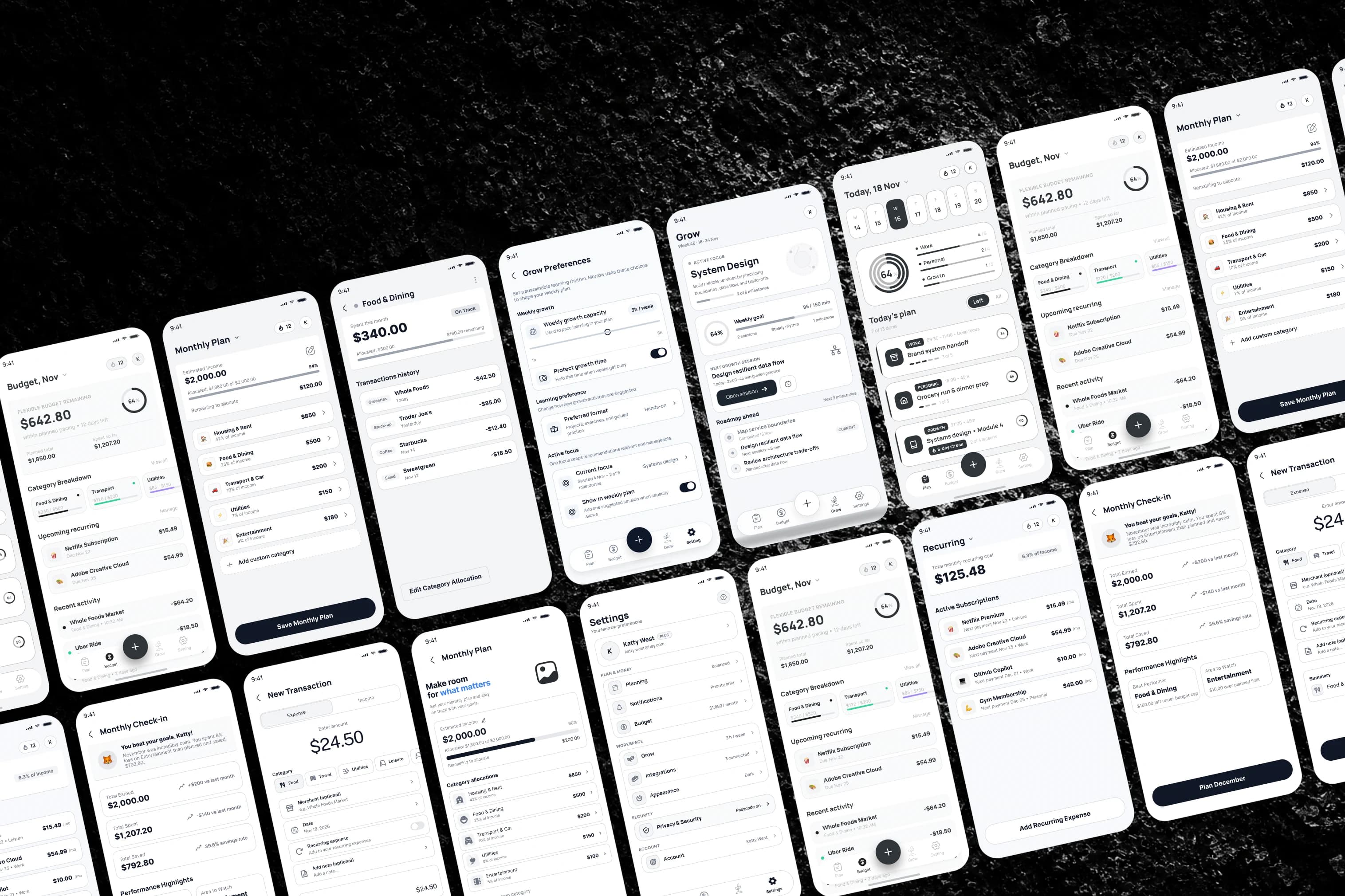
Wireframes
Three promises: Plan, Budget, Grow
A Carefully Chosen Typeface Enhances Readability And Creates A Consistent Visual Language. Balanced Font Weights And Spacing Help Users Navigate The Interface Effortlessly.
- Clear
- Consistent
- Readable
- Balanced
Font Family
Inter Display
Designed by /Rasmus Andersson
Weights Used /Regular, Medium, Semibold, Bold
Heading / TagSizeLine HeightSpacing
#Heading 150px100%-4%
#Heading 240px100%-4%
#Heading 332px100%-4%
#Heading 424px110%-2%
#Heading 520px110%-2%
#Heading 618px110%-2%
#Paragraph 116px130%-2%
#Paragraph 215px130%-2%
#Paragraph 314px130%-2%
#Button16px130%0%
#Label14px130%-2%
#Caption12px130%0%
Colors
Iconography
A clean and minimal, line-based icon system crafted for clarity, and consistency complement the premium lifestyle experience.








Want this for your product?
Morrow follows one fox from its first question to a planned week. Tell us what you are building.
Book a call- 30 minutes. No pitch. We'll tell you if it's not a fit.